THE PAINTING LADDER
PAINTING SKIN BY TERRY COWELL.
When I was given the chance to write a skin tutorial for I took the opportunity to increase my own skill set by doing lots of research. There is a wealth of information on the internet and plenty of books on the subject by artists far more qualified than me. What I can add to the subject is how I direct some of their wisdom towards my own miniature painting.
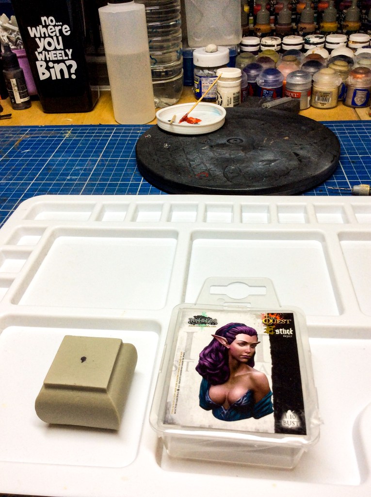
These are the products I used for this tutorial, I decided to create my own skin colours rather than use some of the pre-made skin tones. Some of the skin tones are excellent and most of the time I will use them as a starting point but creating your own skin tones is an instant way to crease harmony of your piece, especially if you use the same colours that are used elsewhere on the figure or bust.
The paints and products used in this tutorial were
- Jo Sonya heavy body acrylic paints.
- A Nocturna models 1/12 Esthel bust
- A size 2 W&N brush
- Custom made bases from Pete Watson.
- You will also need water and a clean paper towel.
I prefer to use a retarder mixed with distilled water but many find this unnecessary and produce amazing results without it by just using water.
Painting skin should be viewed as an organic process and that is to say that there is no single formula for skin. If we just added white to red this could be perfect if we were only wanted to paint Peppa pig!
If this tutorial is successful then it won’t leave you with exact instructions or a step by step process. I would rather encourage you to experiment with creating your own unique skin tones. Your own style and preferences are equally important. There are helpful tips and hints but jumping in and having a play is the best way to learn what works and what suits your needs.
Tubes labelled skin colour do have their uses but painting skin in this way will increase your understanding of colour theory and it will also add interest and harmony to your project.
For this tutorial we are limited to 6 paints red, yellow, blue, white and black. Umber brown is also there but not strictly needed in the method I use but I will explain how it can be utilised later. Actually I should say we are unlimited to those colours because they will provide us with everything we need.
When we paint a miniature or bust we are concerned with the shapes, values, edges and in this tutorial the focus is on the hues or put simply colours and shades of colour.
When we are painting realistic skin on a smaller scale the idea is to emulate what we see in true scale so an understanding of anatomy, ethnicity’ environmental influences and narrative before you start are all useful tools.
Let me break that down with some simplified examples.
Anatomy- we know for example that blood pools in the cheeks and in contrast skin is stretched tightly across the bridge of the nose and therefore this area has less blood.
Ethnicity- we know that Asian skin has more yellow present while Olive skin with greenish undertones is more likely to come from Mediterranean or Mid – Europeans.
Environment – Skin is a reflective surface like any other and depending on the environmental influence we may see subtle colour variations or sharp contrast. You can easily experiment by holding different objects close to your skin.
These are just simple examples but keeping these things in mind before you start will allow you to consider the subtle nuances that change a nice skin tone to a realistic one.
A Tiny Amount of Colour Theory.
Most of us will have at least a basic understanding of colour theory but I was painting for some time before even considering anything barely theoretical so I will run through the very basics that will be useful for this tutorial without expanding into detail.
Red, yellow and blue are known as Primary colours. If we mix two of the primary colours we achieve a secondary colour.
- Red + Yellow = Orange
- Yellow + Blue = Green
- Blue + Red = Purple
These are our secondary colours and placed on a colour wheel Green sits opposite Red, Purple opposite Yellow and Orange opposite Blue.
These combinations are complimentary colours that used together can produce maximum contrast.
We know adding black or white to a colour can make it lighter of darker but another property or tool is that it also serves to de-saturate. B&W reduce the chroma of a hue is like saying they reduce the intensity of a colour (by increasing the amount of grey).
We can also do this by adding a colour to its complimentary colour on the wheel so for example adding a dot of red to a green palette will still leave you with green but a less intense green.
We can split the colours on the colour wheel into 2 sides warm and cool. Warm tones lean towards orange while cool tones lean towards blue.
Narrative – Think about the story for your miniature, if for example you are painting a zombie figure on a moonlit night you might consider a cool palette adding lots of blue or purple in the shadow areas and de-saturated yellow/ green in the lighter areas.
In this tutorial I wanted to paint natural lively skin tones on Esthel, I pictured her as a woodland elf in a well lit palace and thought of Lord of the rings Rivendell as my setting. Her skin would be healthy porcelain pale mid –European in complexion. The first thing I did was searched for subject material and downloaded a selection of characters that had a similar desired look and from these pictures I had an idea on the tonal scale I would need to create. A tonal scale can be simply a base tone, a shadow tone and a highlight tone. You can add further shadow tones or highlight tones as desired but for the purpose of this tutorial we start with 5 different tones. This will make sense later.
Preparation is Everything!
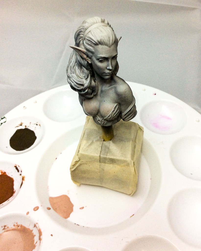
Start by cleaning your bust. Esthel fortunately happens to be beautifully cast but there is always a little work to be done. Very carefully remove moldlines using a scalpel or hobby knife. When you are happy they are completely removed, sand the area using very fine sandpaper or a sanding stick. Wash the miniature in warm soapy water, rinse in clean water and dry. This bust has no holes but occasionally you will find one and it will need to be filled with whatever putty or green stuff you prefer. Then just lightly sand the area and clean.
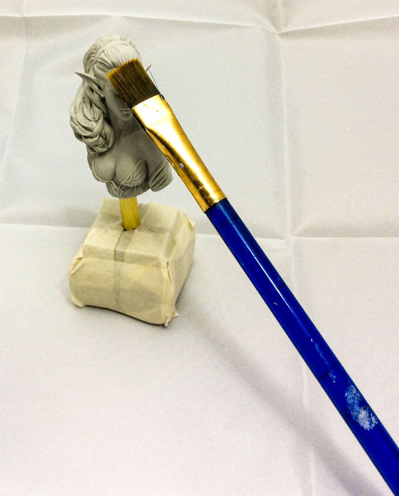
Mount the bust by measuring the bottom of the miniature and the top of the plinth. Place a dot in the centre of each. I have mounted onto a temporary plinth in this case as I started painting before the plinths arrived. Carefully drill holes where marked. I hold the bust in a tea towel when I do this to prevent damage to any delicate features. Once the holes are drilled I glue a 0.35mm rod into place. You may prefer a different size rod but I find this size offers all the stability needed. As a general preference I try and keep the amount of exposed rod limited to less the length of the miniature face. Any more than that and you risk the bust looking as though it’s been suspended in mid air.
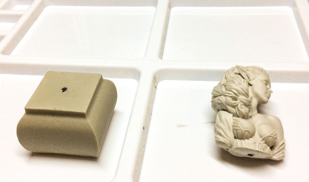
I always keep a wide brush handy to give the miniature a brush down to remove any floating particles before painting. What starts off as a tiny hair can look like a new vein once paint starts to accumulate on it.
Priming your Miniature.
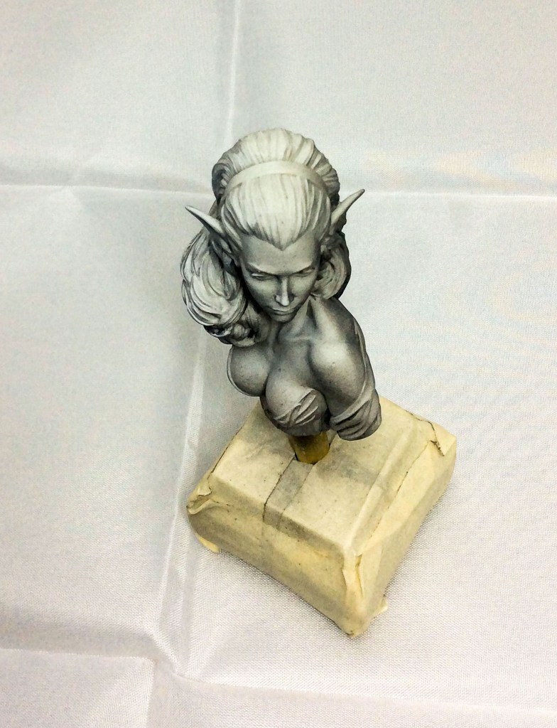
This is a stage that gets overlooked and depending on which artist you talk to, they will attach varying degrees of importance. For some priming is just about covering the miniature with a surface that is easy for paint to adhere to. For me it is the beginning of my paint process so I try to do this carefully.
You can do this with an air brush if you have one or with spray cans if you don’t. Ideally you will need a black, white and grey primer.
Think about where your miniature is in your narrative, where is the light coming from? I have used a ‘zenithal’ light source which is directly overhead of the point of her forehead that is most forward. Zenithal loosely means overhead light source and we often think of the sun or the moon as this light source.
It’s good to keep in mind that you can paint with more than one light source. If you look at some examples you will often see competing light sources that combine on the miniature as a canvas.
To achieve priming on my bust I spray my black from underneath or you can turn your miniature so long as you spray in the right direction. Then I spray across the face and the hair using grey ensuring the spray is parallel and finally I very lightly spray white from above the miniature. You should be left with a result similar to my picture but this part isn’t an exact science and if some areas need adjusting it is easy to do this during your paint process.
The Fun Begins.
There are different ways of achieving the colours and tones you need so before I create my range of value and tones I will show you a little experiment you can try yourself.
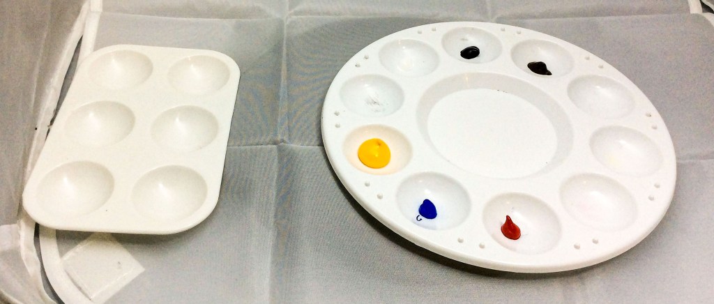
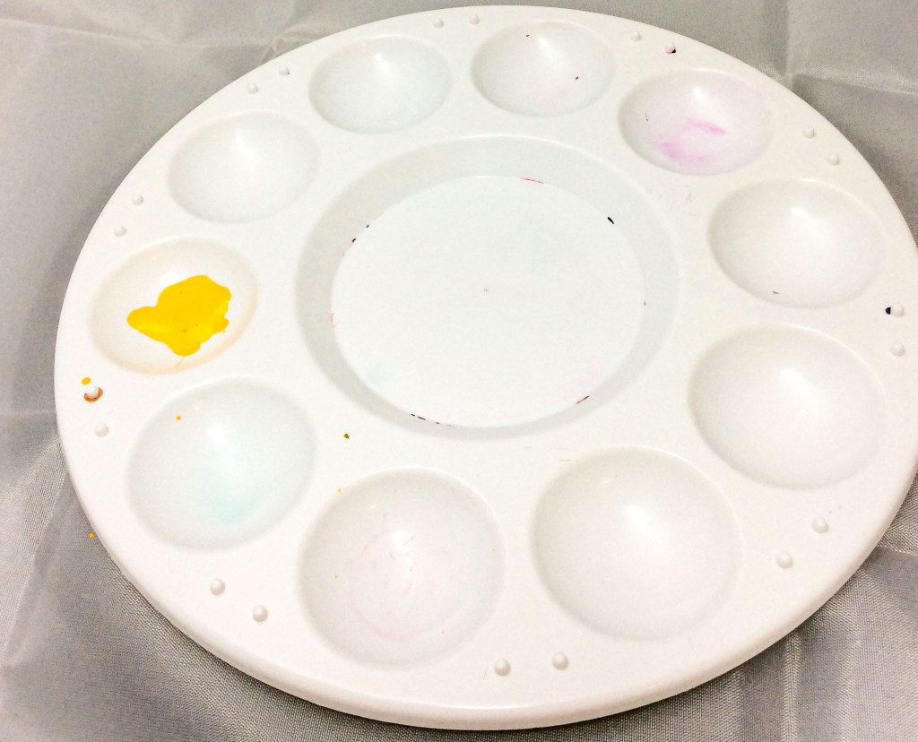
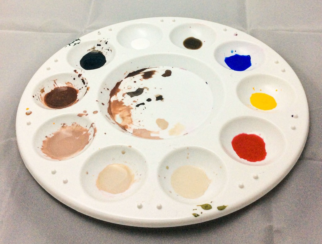
You can see I have all 6 colours in my palette, I will add yellow to 3 wells in a 2nd palette. Then I add small amounts of red, blue and finally red and blue together to each well.
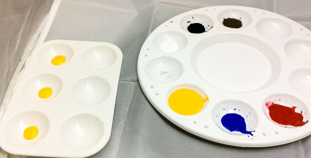
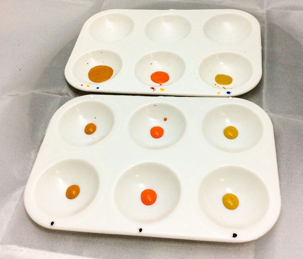
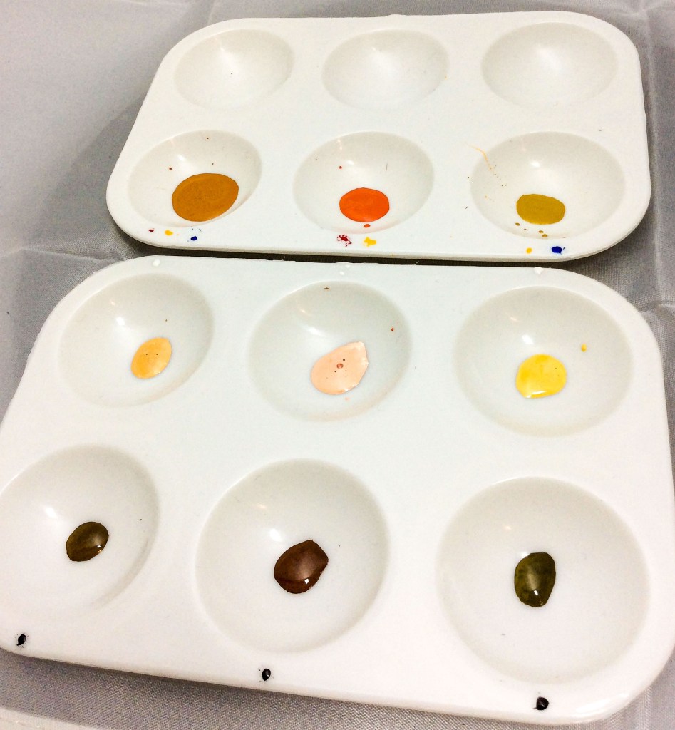
You can instantly see how we now have 3 different skin tones. A cool, warm and mid- tone. I transfer the tones to another palette and add either black or white. These are very basic but you now have 3 varied 3 tone palettes and could easily use this type of tonal scale to quickly paint TT miniature faces considering you will have far less need for detail.
When you want to create a more advanced value or tonal scale there are different ways to get started. You can mix brown/grey by adding any primary colour to its complimentary colour in a 50/50 mix. So for example add blue to orange. Then consider this your starting tone. If you want it to be lighter or warmer add white and yellow. If you want it darker or cooler then add black and blue.
You can also start by mixing equal amounts of the 3 primary colours. If you want to achieve lighter skin tones you can add white and yellow. If you want mid-range tones you can add burnt umber to the mix and of course you can increase the umber and add black/blue for darker skin.
You could also start using the burnt umber and just add red, yellow or blue until it reaches a satisfying tone. Use white at any stage to check if it matches your desired taste.
Which ever method you prefer to use, you will likely meet the same problems. Your skin tone mix may be too green, orange or purple. To rectify this simply balance it by adding the opposite primary colour. For example if your tone is too orange just add small amounts of blue until you are happier with the mix.
Creating Esthel’s Palette.
When I create my skin tones I like to start off with a yellow base. For me its easier to see how red and blue effect the yellow and to work from there and also because the amount of blue or red needed to sharply achieve a visual change is much less than say adding yellow to blue.
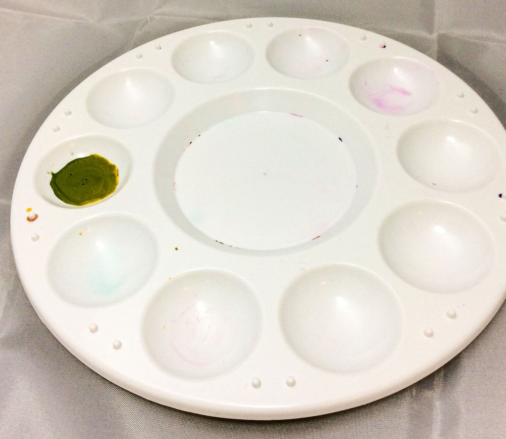
To begin; I fill one well with yellow paint to around 8 parts water or medium. I add a small amount of blue which gives me a vivid olive colour.
I want my skin to be much warmer so I add red to the mix. This gives me a nice warm brown closer to the colour I am looking for. It’s a good tone but very dark so I add white to two more wells. A good tip is that anytime you want to judge how your mix is looking, separate a drop and add white to it. Also if I was doing black skin I might use this darker tone as my base but since I am doing mid-European skin in needs to be lighter.
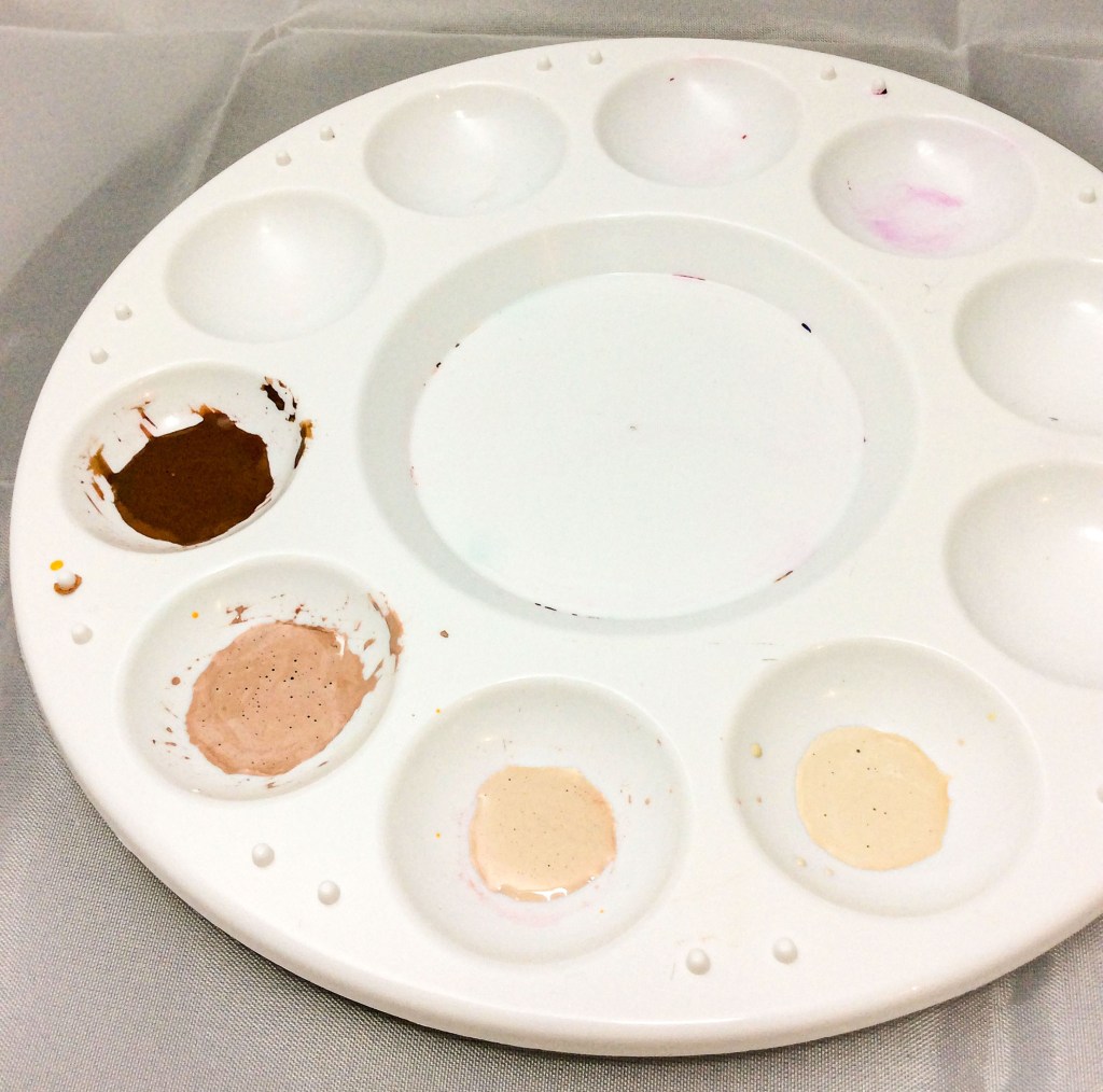
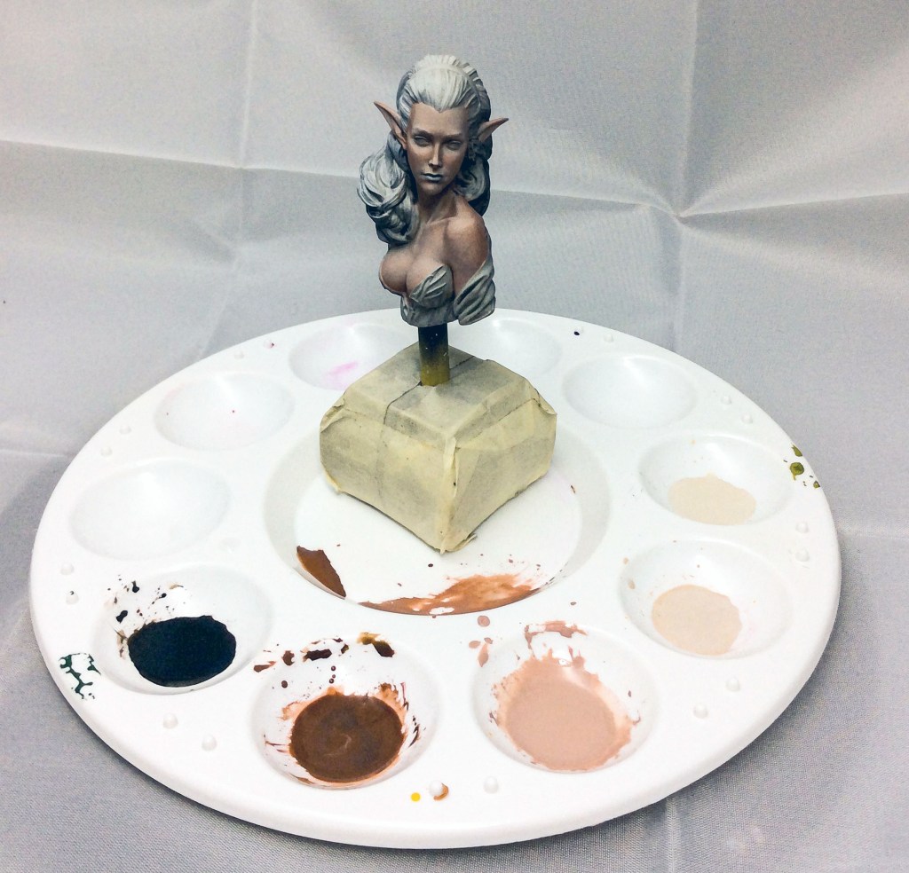
First; I take one brush full of the red/brown mix and add it to the first white well. This gives me a really satisfying skin tone and I decide this one will make a suitable base tone and it is closer to the colours I liked in my reference pictures. I then take a brush full of paint from the base tone and mix it in the next white paint well creating an even lighter tone. This creates a colour which will be perfect for my first highlighting stage. I still need an even lighter tone so I fill one more well with white to create a second highlight. Finally, I create a second shadow tone by adding a small amount of black to our original mix. This process has created 5 harmonic skin tones which will form the foundation stage of my skin painting.
I haven’t disregarded my starting palette of red, yellow and blue because I will still need this for nuances. These are little additions that will really bring the skin to life.
Useful Things to Note.
Ok so before I begin painting there are a couple of things to note. The first stages I would normally do with an airbrush but for the purpose of this tutorial everything is brush painted so that no one is excluded if they don’t own an airbrush.
The 2nd important point I would like to make is that even though you have mixed your paints, try not to think of it as a painting palette but I would rather you thought of it as a dipping palette. The reason for this is simple. I want you to get used to thinning your paint to the desired consistency each time you prepare to place paint on your figure. If you intend to have thick paint to create texture that’s fine but otherwise get used to feeling for the right consistency. As paint stands it quickly starts to thicken so paint you start off with has less surface tension than the same paint 30 minutes later.
Following on from the previous point, dipping into the tonal scale and the original RYB palette allows you to mix as them as required. You may not want to do this initially but as you gain experience and become more confident you will progress to this naturally.
Finally I use the wide brush I mentioned to sweep away any unwanted hairs or dust particles.
Let the Real Fun Begin!
To begin painting the miniature; I take some paint from the mid-tone and place in a space or empty well, add water or medium until you are happy that you have a milky consistency. Dip the brush in the prepared mix so that paint fills roughly two thirds of the barrel. You don’t want paint uncontrollably dripping on to your bust so wipe away the access paint with a couple of passes on your paper towel.
Start at the bottom of your miniature and work towards the top. Cover the whole of the skin area not forgetting obscured areas like inside the ears or under the eyebrows.
Try to execute steady even strokes and during this stage limit your strokes to one pass over each area. It’s important to not unintentionally move about paint you have just placed on your bust so only one pass and move on.
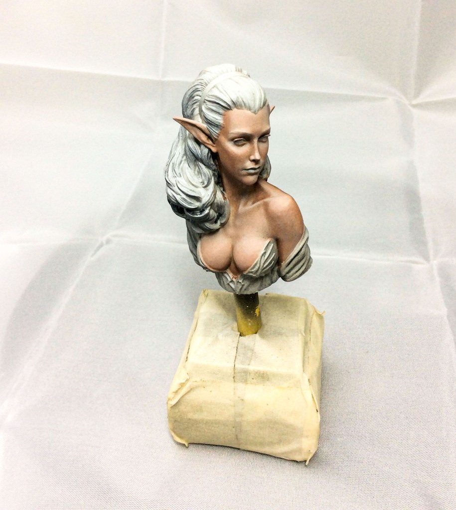
When bust has been fully covered give your brush a clean and then use a hairdryer to dry the first coat. You will notice the bust looks patchy but this is fine. You need to repeat this process another 4 or 5 times and each time you do you can see the transparency becoming less. After the final pass you should have a solid mid skin tone. It will start to bring the bust to life and the priming that you put in place will no longer be visible. What you will still see is tonal shifts between the light and dark areas. We will utilise these.
Out of the Shadows, into the Light!
At this stage you can choose to build up highlights and then shadows or start with shadows as I do. Starting with highlights makes sense because identifying the lightest areas helps you identify the darkest areas but for me I like the final visual impact of adding highlights so it’s like saving the best for last.
I take a small amount of the first shadow and mix it into the base tone. I thin to milky consistency and begin painting in the shadow areas. I paint the cheeks, inside the folds of the ears, under the brows, under the nose, the nose bridge, under the bottom lip, under the chin, the temples, behind the ears, under her breast and the neck. Try to think about the darkest part of each shadow area and push your brush strokes towards them. The idea is that you will deposit a stronger concentration of paint when you lift your brush which helps also to develop volume. Once dry I review the areas, they need a second pass but this time I just use the first shadow mix without the base tone.
Perhaps I should explain here that the idea when trying to retain harmonic skin is that each new layer should integrate with the previous layer. The previous layer had shadow 1 in it so no need to add the base tone this time. I focus on the previous shadow areas again pushing towards the darkest areas.
Ok so focusing only on the darkest of the shadow areas now so under the brow, under the nose, beneath the chin I now mix shadow 2 with shadow 1 and create stronger shadows. Finally I use shadow 2 mix on its own to touch very dark spots under the nose, the inner ear barrel and the deepest part of the brow.
If you stop and review now you will see that that you have created contrast without any highlighting at all but we need stronger highlights to simulate our light source.
Take a moment to reflect back on where your light source is coming from, where on your miniature is closest to the points of light and where which areas are most reflective.
Start by adding some highlight mix 1 to your base tone and start highlighting the raised areas which will reflect light so the upper part of the chin, the areas above the top lip which isn’t under the shadow of the nose, the upper part of the cheeks, the top of the ears, the top of the nose bridge, above the eyebrows and the forehead. Skin absorbs a lot of light so although we can have intense reflection, we can’t just drop a stark highlight without a gradual build up. As light is further away from the point of light it becomes more diffuse. We are creating this effect in reverse order.
The next pass is just highlight 1, we reduce the area we cover moving towards the strongest point of light. We mix highlight 1 with highlight 2 and follow the same process. Then with pure highlight 2 we touch only the strongest points of light. This isn’t the final highlight though and we will come back to it.
Before you continue are there any areas you need to adjust? Check the shadow areas and the highlights; make sure you are happy proceeding. Adjustments are easy at this stage
That Special Touch.
Ok returning to our RYB we can use the same colours for our nuances. Simply put nuances are the subtle changes in colour. These important shifts will help add personality to your bust. Perhaps as a useful way to remember what goes where on a face there is a general rule you might consider. That yellow represents warmer areas and parts affected by light, red represents the areas that will have the most blood like cheeks and the tip of your nose while blue represents colder areas or those in shadow, under the chin etc. Therefore nuances are likely to be upper third yellow, middle third red, lower third blue.
I start by painting the lips. I consider that there is a lot of yellow in my skin so adopting colour theory I mix red to blue and create purple and add purple to my base tone to give me my lip colour. I paint them using about 3 passes. I then take the mix and add more blue to one side and use this to paint the upper lip. The blue represents the upper lip angle creates more shadow. The lower lip I add a touch more white to lighten the mix.
To paint the cheeks I add red to the base tone and thin the mix. I want it thinner than the normal mixes and need to create a glaze. I just use the side of the palette but you can use an empty well too, the mix will be watery and should be at least 10 parts water to paint. When using a glaze, dip your brush into the mix and wipe away the access fluid on your paper towel. Then draw a line on the side of your palette, if this has been done correctly you will see a very faint transparent mark.
I use this to build up the blush on her cheeks by covering first a wide section across her cheeks structure. I push towards the shadow areas. A glaze dries very quickly as the thin mix is absorbed quickly. I add a touch of blue to the glaze and push towards the darker areas reducing the area of application each pass. I use this same mix to add colour to her breast keeping in mind that the blood sinks towards the bottom.
Then I return to the lighter areas of her cheeks and use the base tone and red glaze mix with added orange created using our yellow and red. This brings a little more warmth to the front upper cheeks.
I then add yellow to my mid tone mix and create a warm glaze. With this I cover the areas closest to my chosen light source. This includes the forehead, the top of the ears and a touch to the top of the nose.
Finally I add red to blue to create purple and add lots of white to create a final highlight. I thin this down to a glaze and touch the points I want the highlight to be most speculative. Again this utilizes colour theory. If you have done this correctly it won’t even be noticed by someone who is not an artist, all they will see is a harmonic natural looking skin.
Final Thoughts.
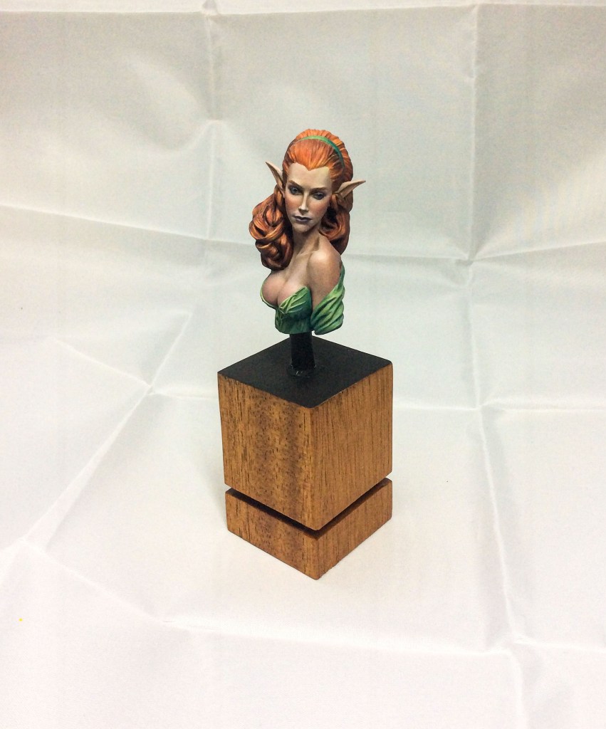
With the skin complete, I wanted to show you a finished product and painted the hair, eyes and clothing also using the only colours in this set. When we use only a certain number of colours we refer to this as a limited palette but its something everyone should experience. It frees your creativity.
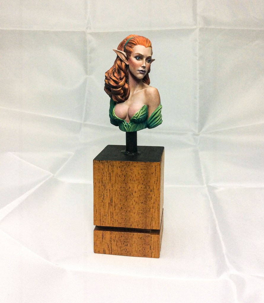
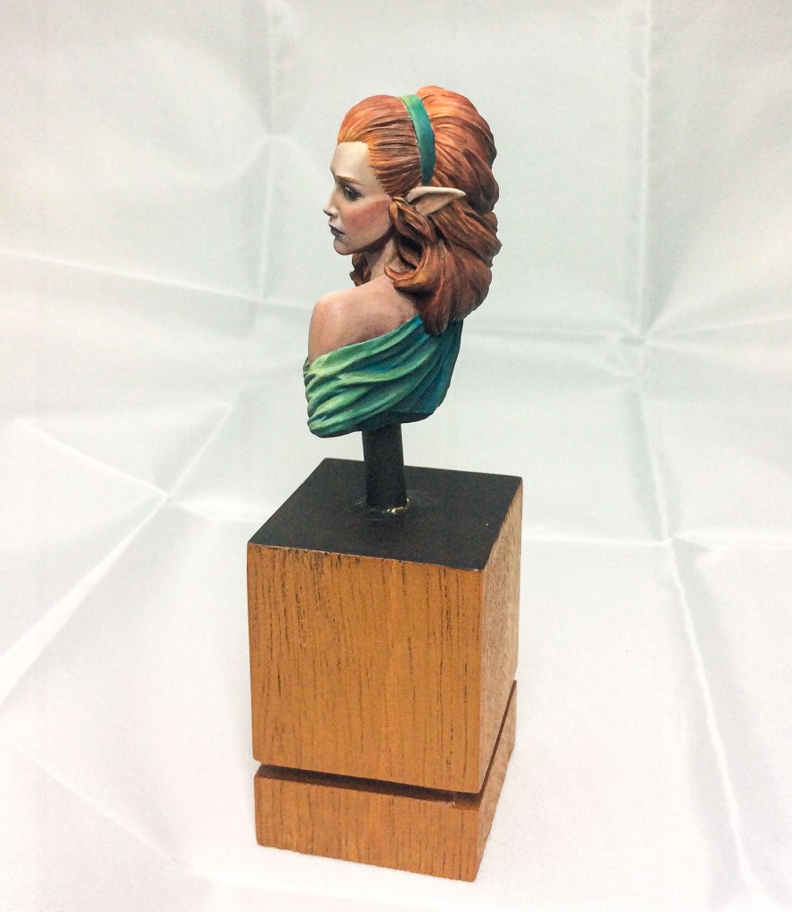
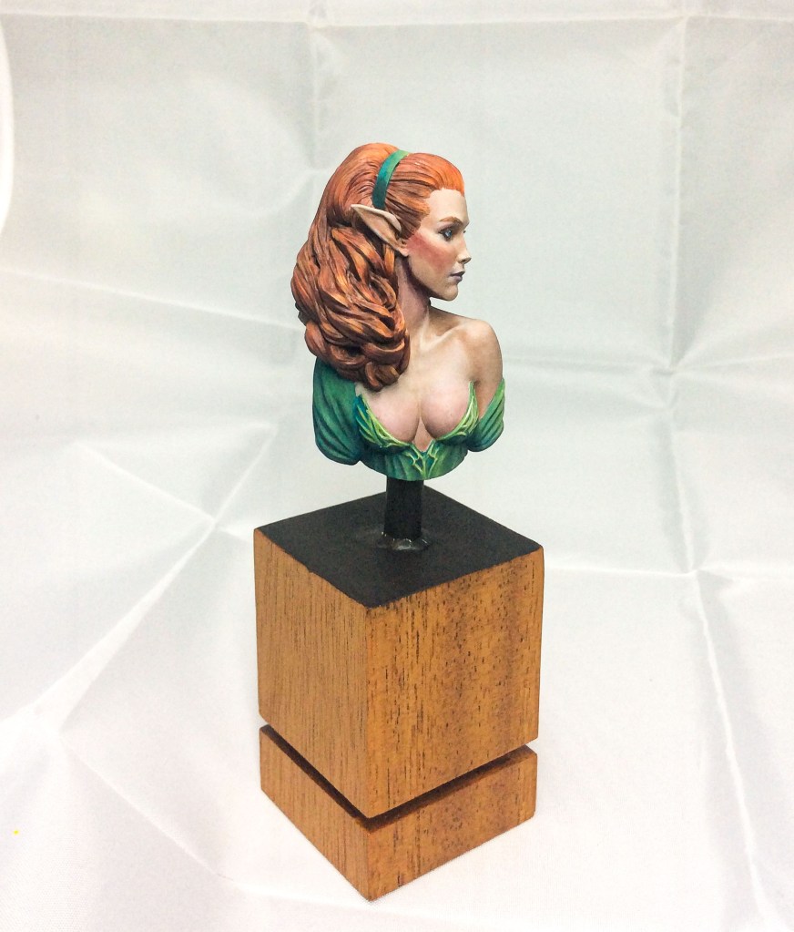
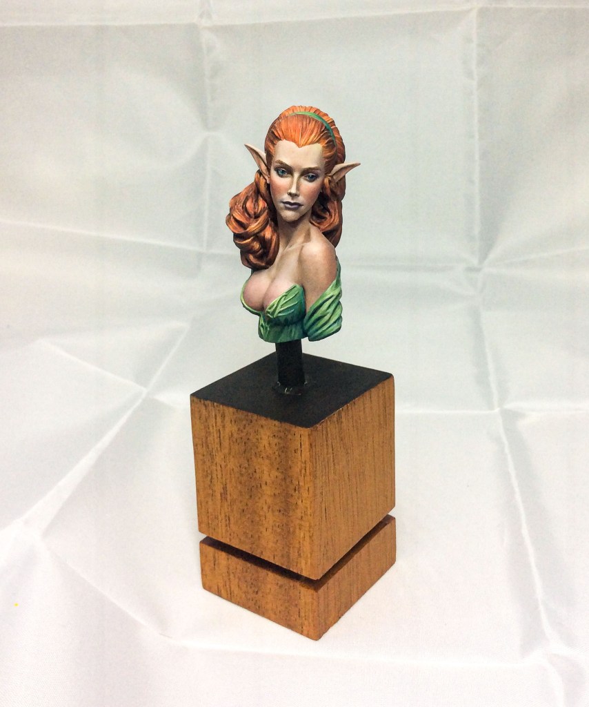
Of course there are many variations in skin and painting it in this way is far more natural and interesting. Skin isn’t just pink, it’s a canvas that absorbs and reflects colour. Hopefully, this tutorial will encourage you to be brave and experiment. If you do, it will improve your painting in general.
It’s been good to indulge and learn during this thoroughly enjoyable process and hopefully it will encourage someone else to experiment. As a last thought, I would recommend investing a good colour theory book. I have only touched on theory here and while the foundations are basic the well runs so much deeper. I still have so much to learn and comprehend but I do know that grasping this understanding will profoundly impact our painting ability.
Thanks to Shane Rozzell for discussions around this tutorial.
Kind Regards and happy painting.
Terry Cowell (The Painting Ladder)
Product Bookmarks.
